
Website Design · Logo Design · Visual Identity
Kind Cooking
A community-focused nonprofit with no existing identity. CCD drew the logo, built the visual identity around it, and designed and developed the website it lives on.
- Client
- Kind Cooking, a North Texas 501(c)(3)
- Scope
- Website Design & Development, Logo Design, Visual Identity
- Live site
- kindcooking.org
Identity
The logo came first
A cat chef holding a wooden spoon, with a broccoli on the apron. It is drawn rather than set, so it reads as warm and hand-made at the size a nonprofit actually uses a logo: a website header, a flyer, a social avatar.

The lockup is the primary form. The mark carries the identity on its own where the name is already present or there is no room for it, which is what keeps a small organization recognizable across a site header, an icon, and print.
Website
Designed onto the mark
A warm off-white ground, the drawn mark at full size in the header, and a short list of high-contrast action colors that keep donating, volunteering, and reading about the programs visually distinct.
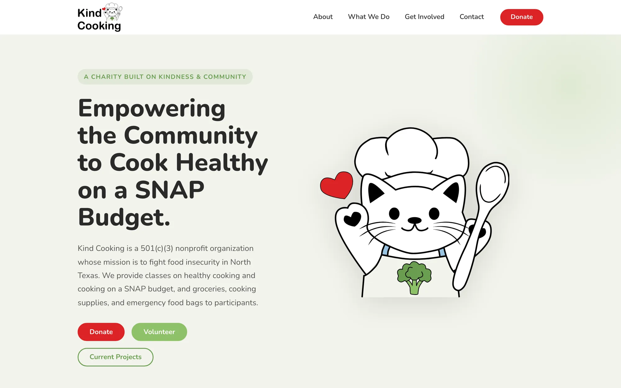
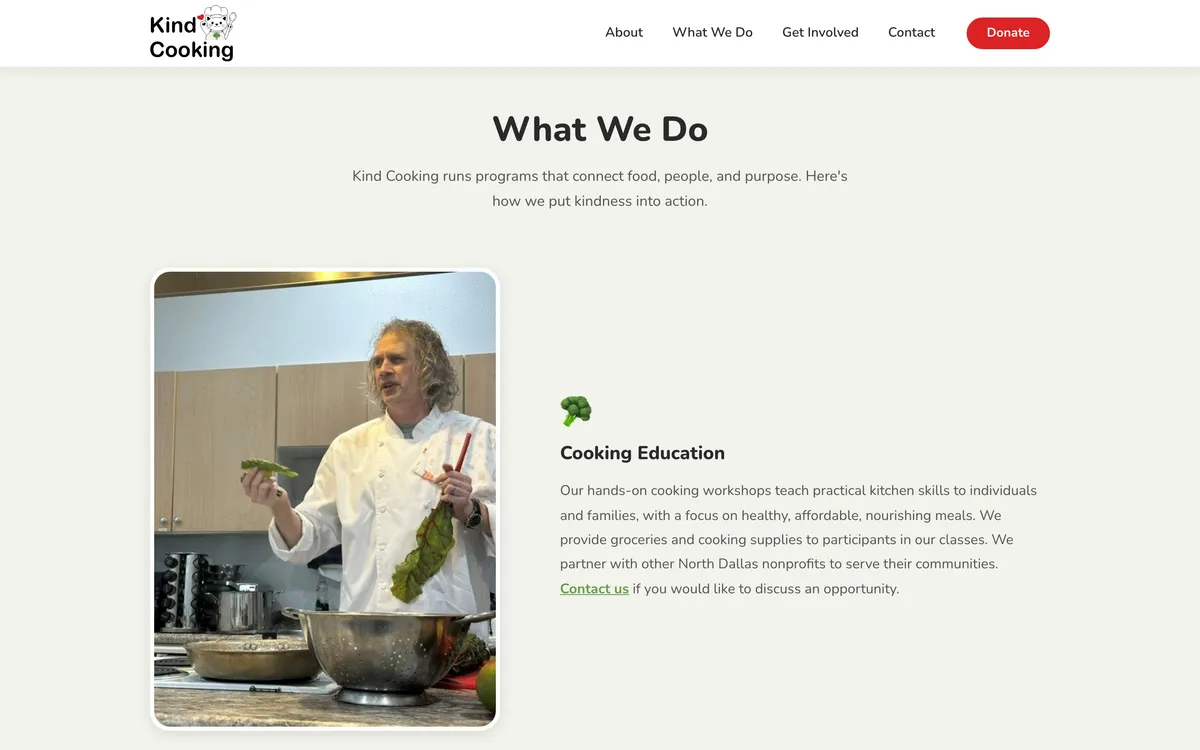
The programs read as a short list a visitor can scan: a photograph from a real class, a heading, and two or three sentences. The site has to explain cooking education, grocery support, and equipment support to people deciding whether to attend, volunteer, or donate, and each of those needs a different next step.
Responsive experience
The same identity on a phone
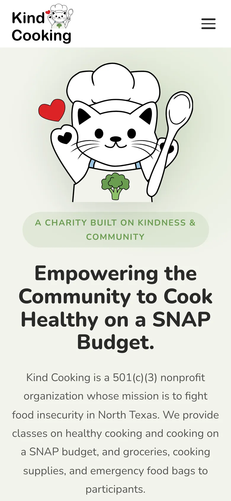
Most of the traffic a small nonprofit gets arrives on a phone, so the narrow layout is not a reduction of the desktop one. The mark stays at a size where the drawing is still legible, the two action buttons stack at full width, and nothing that matters is hidden behind the menu.
Contact
Discuss a project
Send a short description of the project: what it is, who it is for, and roughly when it is needed. Scope and deliverables are agreed per engagement.
Direct email. The site has no contact form to get lost in.