
Website Redesign · Logo Redesign · Visual Identity
Texas Business Litigation
The Antitrust & Business Litigation Section of the State Bar of Texas had a website and a logo that both predated the way its members actually use them. CCD redrew the mark and redesigned the site around it.
- Client
- Antitrust & Business Litigation Section, State Bar of Texas
- Scope
- Website Redesign, Logo Redesign, Site Structure & Navigation, Visual Identity
- Live site
- texbuslit.org
Identity redesign
A mark, not a line of type
The original identity was a typeset lockup: an outlined star between the word SINCE and the year 1976, the section name set below it. CCD redrew it as a seal, which is the form a State Bar section is actually read as, and which survives being reproduced at an inch wide.


The redesign keeps what the section is entitled to keep: the Texas star, the laurel, and the navy it already used. What changes is that those become one drawn mark instead of an arrangement of type, so the identity holds at a favicon, in a document header, and on a conference badge.
The two current marks are one identity, not two options. The header variant is the same star and laurel without the rings and the text around them, for use beside the section name at a size where the ring's type would be unreadable anyway.

Website redesign
Same material, findable
The section publishes court reporting, CLE course materials, a journal, webinars, and an annual meeting. None of that changed. What changed is that a member can now find a specific thing without reading the homepage first.
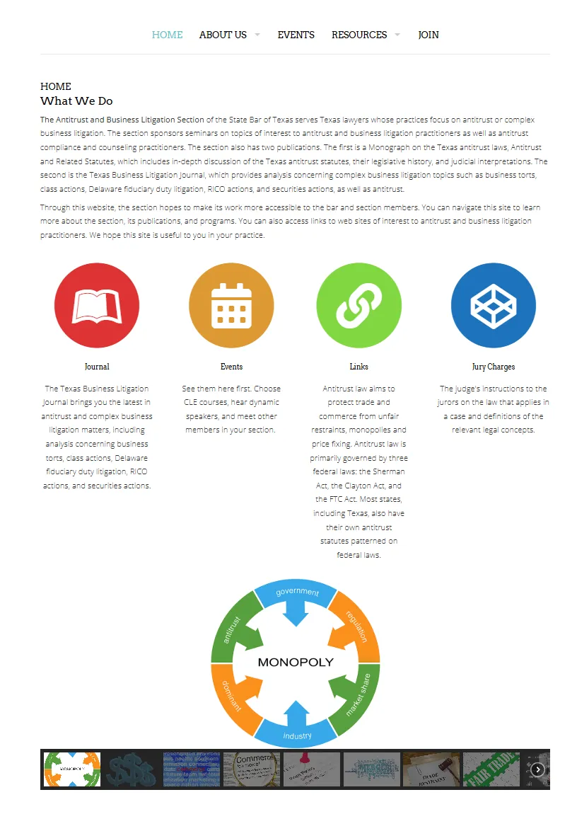
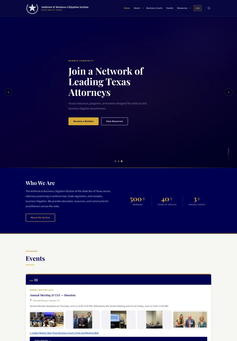
The original put every kind of content on one plane: four colored circles, a paragraph each, and a thumbnail strip, with no way to tell which of them was the thing you came for. The redesign gives the section a real menu, a hero that says who the site is for, and separate landing places for membership, business courts, events, and resources.
The palette is navy and gold with a serif for headings, which is the register the material already had in print. The reference pages are the constraint: they are long, they are read rather than skimmed, and they had to stay comfortable at full length.
The current site
Reference pages and phones
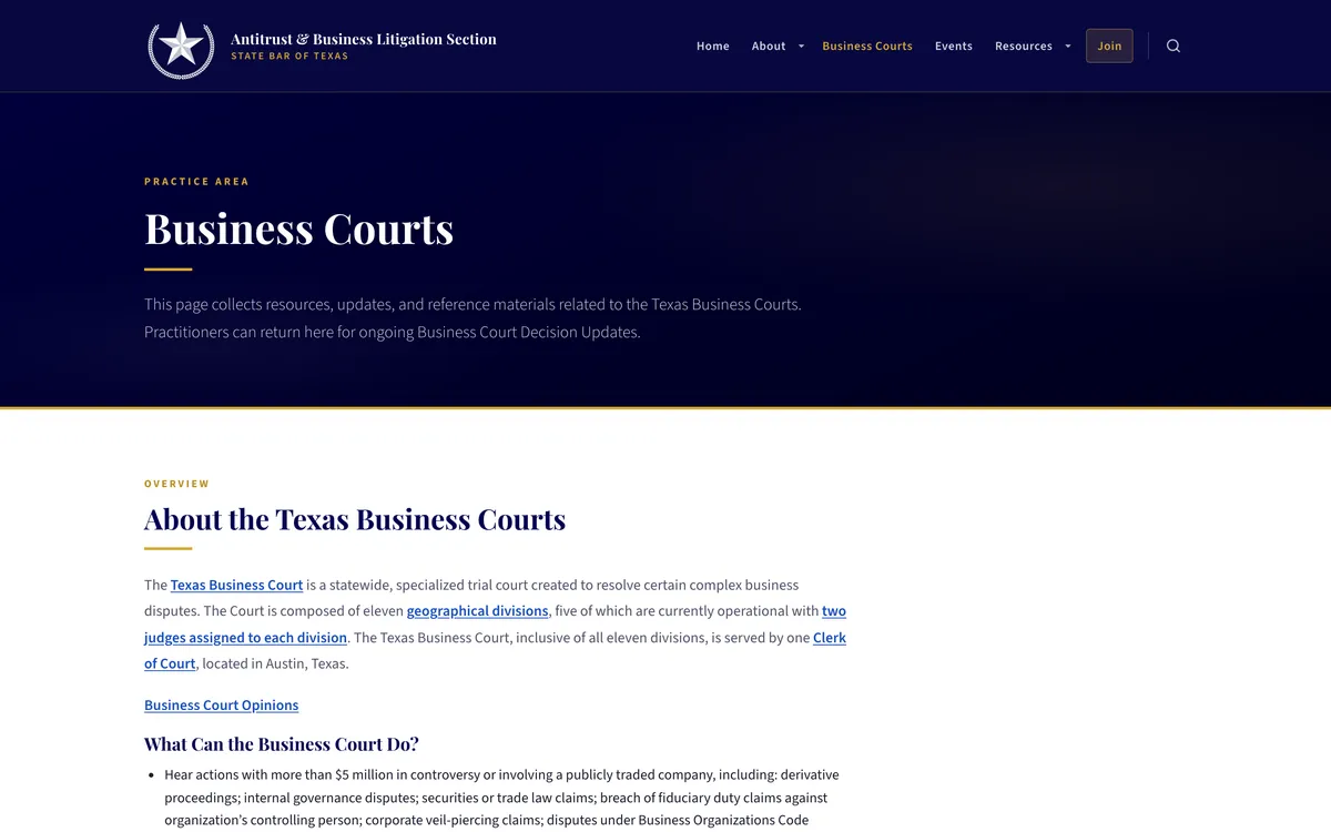
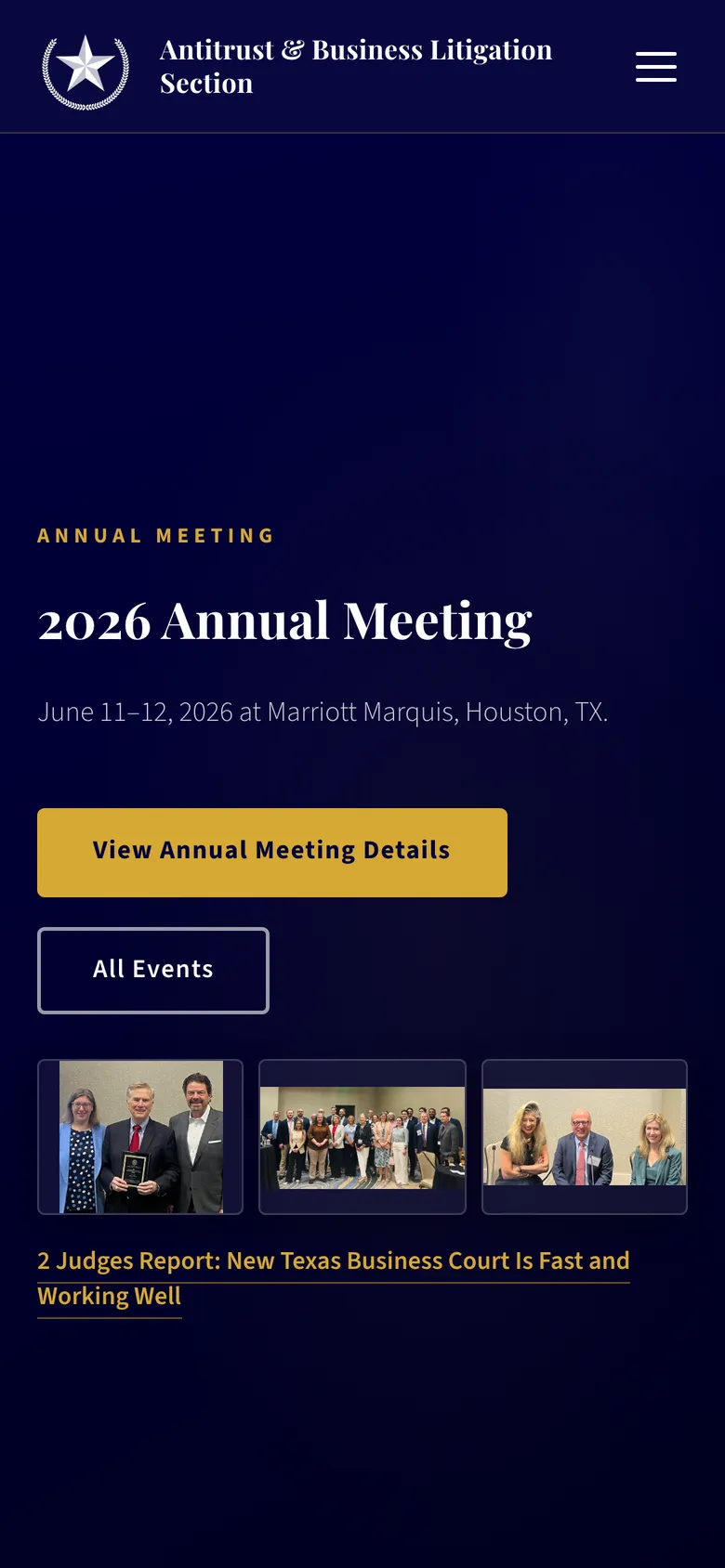
The seal is what makes the small end of the system work. At phone width the header keeps the mark and the section name and drops everything else to a menu, and the reference pages reflow to a single readable column without losing the heading structure that makes them navigable.
Contact
Discuss a project
Send a short description of the project: what it is, who it is for, and roughly when it is needed. Scope and deliverables are agreed per engagement.
Direct email. The site has no contact form to get lost in.